 hotoshop:
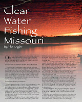
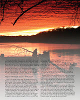
The fishing mag spread shows my proficiency in Photoshop because I utilized a lot of the basic and more advanced tools to get the exact result I wanted. I was again forced to figure out what tools I needed to use and how to use them with this project. I knew I needed to make a white fade at the bottom of my spread but I had no idea how to go about that. I used the gradient tool and used a white screen gradient to get the effect so I could use black font. It also gave it a foggy feel, which helped contribute to the overall design. Working with the image was also a challenge. I found it on Google images and thank goodness it was a larger photo to begin with because it was still difficult to work with. I could only imagine working with a smaller photo. But it was fun to get to work with the Adjustments toolbar. I was already familiar with many things available in that toolbar, but I discovered more that I wasn't aware of such as the Curves and Levels. This project is an great example of a good design coming from a learning experience.
No comments:
Post a Comment