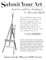
I had a significant amount of difficulty with these, as you can already see just by looking at them. It was a good way to dust off the cob webs and get my mind thinking compositionally again. My first mistake was the fact I didn't use a grid system. The "Submit your art" flyer looks as though it could have one, but it's very basic and doesn't have a solid balance. The "Greek" flyer is way more mamby-pamby and has very poor balance. You can tell I was getting tired and over thinking things by this point in the process.
On top of layout issues, I had resolution problems with
the images I COB'ed. They looked fine in PS and even decent in ID, but as soon as I turned them into pdfs and printed them, I knew I didn't set the resolution high enough.
The "Greek" flyer is also having bleed issues in that the curtains on the upper left hand corner are over a centimeter away from the edge of the paper making it look quite horrid.
In my future reworks, besides being careful not to do everything bad that I already did on these, I plan on simplifying because each of these looks a bit cluttered and the use of negative space isn't all that great. I also want to use my typography skills a bit more,
which will help in the simplification process. Overall, I need to design better. The end.


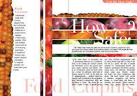
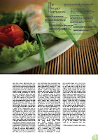 This layout looks super goofy right now, only because I wanted to see what image works better with the final body text, font and headline. I decided I'm going to get rid of the plate image by the header and extend the image on the left past the gutter to make the layout more asymmetrical. I'll also work with the header and enlarge it to make it stand out more, and to fill a bit more of the negative space that will be above it after the plate image is removed. This one's getting there a bit quicker than the How Safe? layout, which is a nice feeling. Though both of these took me upwards of three hours combined to complete. Hopefully I can make some changes here and there to make them more solid for the final layout presentation.

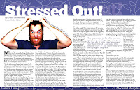
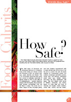 I'm still having issues with the bars in this layout. I'm going to continue to streamline the design, subtracting the excess bars and type to make it more elegant and simple. I may decide to change the picture to a more interesting one, but I guess that'll depend on if I can find one or not. I'm also going to mess with the page number and article titles in the corners of the layout. I'm not really sure if they will work as well once I alter the design.
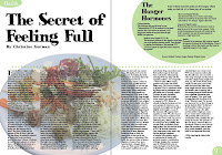


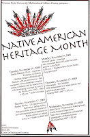


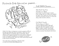 s went a bit better than the first two. I decided that I would prefer to add some hand-drawn flair to my designs, so I gave it a try. I'd like to incorporate more hand created work into my design production because I believe it makes the design pop out more, especially in a sea of highly computer processed design. In this case, I didn't do so hot, but it was only my first try at i
 page. I still have a lot of work to do to pull together good design in the little time we have, and also develop my own personal style in my work.
