Example of Best Thumbnail Color Comps:
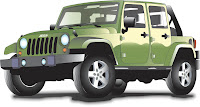
My best thumbnails were the Jeep poster thumbnails. I had the best selection of possible compositions to choose from, and whichever one the client chose, I made sure I wouldn't hate any of the compositions I had created. I made sure the concept was almost overly simple because my eye tends to go to the image that stands out and the most simple placement of text. I think the majority of these thumbnails accomplish that goal. I also chose not to u
se any other color besides that of the Jeep just so the image could stand out more on a white background. This thumbnail process was the most successful in helping me visualize what the final composition would look like.

Example of Best Marker Comp:
My best marker comp was the Jeep poster marker comp. It was the marker comp most closely resembling the fina
l production and it was the tightest, most efficient comp compared to the rest. I did have a bit of trouble rendering the text, and the placement of the Jeep was a tad different on the final production, but those were the two minor differences. This comp took me an extremely long time to render, even though it was only half the size of the final. I believe because I took the time to comp the poster correctly, creating the final poster was that much easier.

 ng:
ng:
 ography/Typesetting:


 hotoshop:

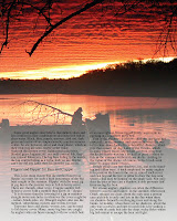
 portant in conveying my personal design style, and uses a quality photo well. I did have to make some changes to the copy because one I had the text into place, I realized there were way too many separate paragraphs and it looked really broken up. I took the liberty in reading the text to see where I could attach certain paragraphs so the story would still flow while maintaining aesthetic coherence. Otherwise, the copyfitting was almost dead on, minus a couple really minor measurement mistakes. It was a challenge trying to make the text show up on the photo. I first wanted the text body to be reversed (white) but that would risk mistakes in the registration process when printing the final production. So I altered the image in PS and I believe the solution works well. This was a good learning process and I believe the final production shows strong points in my style and way of working with the programs. I also like working with magazines a lot more than pamphlets, and I think that is also apparent.
 This
This process went a lot smoother than previous InDesign pamphlet designing. Transferring my ideas into the program was a lot easier because I had a plan before hand, because I had the copy fit to the space I intended, and because I am now a lot more familiar with the attributes to the software. Printing also went a lot smoother in that I knew what I was doing do I was more efficient and had no issues in the process. Copyfitting did help visualize the final design. There were only a few minor copyfitting errors that were not able to translate coherently in the final design, but otherwise, it was very accurate. I do wish I would have printed to thinner, non-glossy paper so folding and assembling would have been more efficient. There were tears in the paper from me forcing it to fold. I wish I would have made the font of the informational text larger or more bold because it is really light in the final production. Overall, I think my pamphlet is a bit boring when it comes to eye catching colors and visuals, but the color scheme I used is very soothing to the eyes and besides the font being to thin, conveys the intended information well.
 the pamphlet because there was less text to copyfit, I knew how to copyfit more efficiently at this point, and there was less space that needed a design. I like designing magazine spreads a lot more than pamphlets to say the least. I did have trouble drawing the header text, which will be white in the final production. I also need to figure out what I am doing with the text. I originally planned for the text to be reversed white, but I think I'm going to make the font smaller. If I do make the font smaller, I'll have to figure something out to avoid making the text white. I think I'll have the darks of the background photo fade to white at the bottom so I can keep the text black. That way it is easier to read, and there won't be a big registration risk in the printing process.

 is marker comp was exceptionally difficult, not only because there was so much text to copyfit, but also because I'm not gifted in the art of pamphlet design. I really can't stand designing them and I believe that shows in this design. I did make a huge improvement in copyfitting, though. I now fully understand the importance of going through the trouble of copyfitting, though I'm most likely never going to use that tool once out of school because the computer software does that for you now. This marker comp took a long time to complete. It was tedious going through the copyfitting process that deals with math. I had no idea I'd be forced to use my calculator for any of my design classes. Not that it's a bad thing, just not something I was expecting. I think I'm improving on making marker comps overall.
 thum
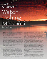
thum bnail of choice in the latest meeting. All of the thumbnails suggest that I am going to put a photo in the background and then add the type and headers on top, most likely in white. This layout is one of my favorites because of the balance between the text and the focal point of the image. This layout also suggests incorporating additional photos of successful fishermen and their catches in the lower right hand corner of the spread. It should be interesting working with large format photos in the layout and I hope to find a good photo that will allow for having consistent white text (so the image is darker in the areas where the text is going). It will be fun working with these elements...hopefully.


 mp. I had all the information ready and all I had to do was enter it in to the computer. I did have trouble inserting the Jeep into the final poster. As a result, I learned how to save the Jeep graphic as an EPS file while still in Illustrator, then export it into my InDesign document. This way it is still in vector form, it is a better quality image because it is not in bitmap form, and it can be resized easily without loosing quality. This is a really helpful tool to know for future reference when inserting graphics from Illustrator into InDesign. As far as the effectiveness of the final poster, I think I could have been a bit more creative with the use of the four colors available. I do like how I kept it simple overall, though. I believe it conveys the message effectively. If I had more time, I would have gone into AI and added mud to the graphic to further add to the mood of the event being advertised.
 ole new set of reasons. Adding color was a challenge because I was only able to choose 4 colors to apply to the Jeep illustration. This will be a challenge to translate these colors into the final poster because I may have to delete some color from the original Jeep. I also had a fight with the pen I chose to use to write the informational font. It smeared very easily and took a while to dry. That was my stupid mistake, and it added time to the project because the ink had to dry. It also ruined the final comp when I went to put it onto the foam board. I smudged the text when I pressed down on it, which was very frustrating.