Saturday, December 11, 2010

Final Part III: Best Formal Project #4


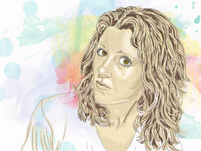
The reason I chose this self portrait project as my best project is because of the different factors surrounding its creation. When I illustrated this piece, I had literally just gotten familiar with the photoshop illustration technique. I really hadn't begun to even enjoy photoshop illustrations. When I started illustrating this, I just sat there and went at it without really thinking too much of it. In the process, I happened to stumble upon my own individual technique within photoshop utilizing specific steps and specific layers that I would continue to use on all of my photoshop illustrations throughout the rest of the semester. And when I was finished, I realized I had enjoyed the process of its creation, just as much as the final product.
This project marks the beginning of me taking to photoshop over all the other mediums we worked with in class. Because photoshop illustration is much more forgiving than gouache or watercolor, both of which I continuously struggled with all semester, I was very fond of spending the time to put in little details. I obviously hadn't yet mastered my technique so there were many instances when I found myself illustrating in the wrong layer, which is still one of my more common mistakes. But the restarting doesn't involve completely starting over like hand-illustrated art does. It's also convenient because I didn't need to scan my artwork into the computer, then mess around with color balancing just to make it resemble the original. Photoshop illustration gives so much more freedom, it's sort of a no brainer to use it.
So overall, I am really glad photoshop illustration was touched on in class. I know I was supposed to be doing more of the hand-made work since that's mostly of what the coursework calls for. But I wouldn't have been able to discover the style of illustration that came most naturally to me. Photoshop illustration has changed my perspective and added a very helpful, not to mention marketable, aspect to my style as a designer.

Final Part III: Best Formal Project #3


This project was definitely one of my favorites. I got to utilize both my photoshop illustration skills and my layout design and typography skills. I think the is the first project that I was able to see first hand that I'm capable of illustrating for particular design related projects. I can definitely see myself using my photoshop illustrations in my future design work. Some issues I had with this design was that when I first started it, I was nervous that I wouldn't have time to finish it. It's a very detailed image that took a lot of time to get the colors just right, then add the highlights on top in a way that still looks elegant and not as graphic as I typically make my art and design look. I think that was definitely the biggest challenge for me. While it does still look somewhat graphic, I think I was able to achieve the necessary amount of elegance to fit with my book cover design. And surprisingly enough, I did have time to illustrate another photoshop illustration for the back cover. I needed something to balance out the layout and still fit with the themes of the book and I think my quill and ink dish also accomplish that. Overall, this was another illustration that shows my development with the specific tools and techniques unique to photoshop illustration.

Final Part III: Best Formal Project #2


The airbrush project was definitely very challenging and frustrating. Despite the fact that I struggled with this illustration for 4 hours, I think it's my best hand-made piece I did throughout the entire semester. There were a few times I almost gave up on it, but I kept going and, aside from a few mistakes, I was able to pull it off. I corrected my mistakes with some hand-done line work, then the rest I retouched in photoshop. It's also really cool to know this was my first attempt at my first full illustration with the airbrushing technique. While I'm happy to be done with it, I would actually consider using airbrushing as an illustration tool for my design work in the future.

Final Part III: Best Formal Project #1


I chose the album art project as one of my best formal projects because it shows my proficiency in photoshop illustration. For this particular project, besides using my personal layering technique and layer styling, I used some other hue changing techniques in order to change the color of the initial balloon animal I illustrated. Prior to this project, it didn't occur to me that I could use other effects, filters and tools on my finished illustrations. It was a great discovery since now I can continue to learn new methods and tools. It was also a challenge to resize what I had already illustrated into two other smaller compositions. I do with I had done this differently so they would all be exactly the same, but unfortunately, I didn't crop the arrangement of illustrations, so I had to manually position them within each of the smaller comps. Though considering this, I believe I did a good job eyeing everything out. Overall, this project was really fun with all the fun discoveries I made in photoshop.

Final Part II: Best Marker Comp


I chose the photoshop marker comp that I did for my event poster because it shows that I was able to choose the color scheme and apply it to the initial artwork and composition of the piece. The line work was near complete and I only had to make some minor changes to it. The technique I used to add color into the line work was the basic paint tool in photoshop. I added a low opacity fill to the particular shapes, then went back in to highlight and lowlight. This marked the first epiphany I had as far as developing my own personal design technique within photoshop. After this marker comp, I began to utilize layers a lot more and discovered I could get really detailed work done with just the brush tool and color tool in photoshop.

Final Part I: Best 10 Technique Exercises


For my 10 best technique exercises, I chose 3 line art by hand, 3 line art in photoshop, 2 8.5x11 watercolors by hand and 2 photoshop watercolors. I chose the 3 line art by hand pieces because they show my best quick line-work for practice. Not having taken a drawing class in a while, I was very surprised I was still able to crank out some decent line work, which turned out to be helpful on many projects that followed in illustration class. I chose the 3 photoshop line exercises because this was my first experience with the photoshop illustration techniques demonstrated in class. I was a bit shaky at first, but then I was able to draw these three, which I was very pleased with and these drawings ultimately hooked me on photoshop illustration. The 2 watercolors that I did by hand are examples of my best a favorite works. The really bizarre and surreal one was an experiment in which I put down the color first, then drew in the line work depending on what shapes I perceived the paint blobs to be. It was a fun and interesting exercise. The lighthouse was one done in class in which I had more time to complete. I really like how it turned out. I had a lot of trouble with watercolor and when I was able to paint this particular painting, I began to like it a bit more and felt more confident that maybe I'd be able to actually use it as a designing tool one day. And the last two are examples of watercolor and line work done in photoshop. These two were my best out of the 5 assigned to do. They show how I progressively became more confident with color and the different brush options within photoshop. They also show another step towards my preference for photoshop illustration over hand-done techniques.

Thursday, December 9, 2010

I Make Prettyful Artzzz!


I spent 4 hours airbrushing this damn kitten, which I got so attached to him in the process, I named him Mr. Wigglesworth. I think it came out ok overall, minus a few mess-ups, which I was able to take care of in photoshop. Hopefully it's cheesy enough to live up to the project specifications. Oh, and I guess I should add that this is my first experience with any sort of airbrush ever. I tried a couple exercises, but not all because of soccer so it's amazing I got this done in 4 hours.